Violin plots with plotly with dropdown menu in R
Index
This post illustrates what is a violin plot and how to create Violin plots in R with plotly with a dropdown menu.
What is a violin plot?
A violin plot combines in the same visualisation a box plot and a density plot. Therefore it allows to understand with a blink of an eye the minimum, max, 1st quartile, mean, median, 3rd quartile and frequency of multiple variables in a data frame. The shape of the violin density plot expresses the frequency of the observations.
When a violin plot is useful?
Violin plots are useful to do a first exploratory analysis of the variables in a data set. They easily help to understand and compare variables of different sizes.
When the number of points is huge then the violin plot is a good tool. With a lot of data, for example, doing a scatter plot is not practical.
Violin plots in R with plotly with a dropdown menu
With plotly it is possible to create a static violin plot with a dropdown menu.
The advantage of this plotly violin plot is that it looks quite interactive and it is contained in a static html file. Moreover, in just one plot it is possible, as in the example below, to compare multiple variables grouped by another variable.
The disadvantage of making such plot is that if the dataframe behind the plot has many observations than the plot can become too heavy to display. In this case there are few options:
- make a violin plot without plotly dropdown menu;
- use a less interactive library to create the violin plot;
- build a shiny app with a server querying only the relevant data;
- do a sampling of the data before running plotly.
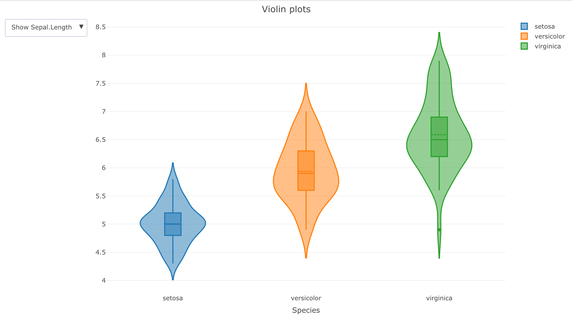
Here below there is an example with plotly dropdown menu:
This is the code used in the above example:
library(plotly)

df <- iris
y_axis_var_names <- c("Sepal.Length", "Sepal.Width", "Petal.Length", "Petal.Width")

create_buttons <- function(df, y_axis_var_names) {
  lapply(
    y_axis_var_names,
    FUN = function(var_name, df) {
      button <- list(
        method = 'restyle',
        args = list('y', list(df[, var_name])),
        label = sprintf('Show %s', var_name)
      )
    },
    df
  )

}

violin_plotly <- plot_ly(df, x = ~Species,
    y = ~Sepal.Length,
    split = ~Species,
    type = 'violin', box = list(
      visible = T
    ),
    meanline = list(
      visible = T
    )) %>%
     layout(
         title = "Violin plots",
         yaxis = list(title = ""),
         updatemenus = list(
             list(
                 buttons = create_buttons(df, y_axis_var_names)
             )
         ))

violin_plotly

# htmlwidgets::csaveWidget(as_widget(violin_plotly), "violin_plotly.html") #to save the plot as a stand alone html file